Email Design Tips: A Guide for Non-Designers
By Sean Tinney April 5, 2022
Rather listen or watch? You’ve got it! 👇
How important is the design of your email? Is a compelling message enough, or do you need to have gorgeous visuals as well?
If you’re like a lot of time-strapped business owners, you may not have had the opportunity to do much with your email design.
However, adding some design elements could improve your email performance significantly. Why? Because studies show that 90 percent of the information transmitted to our brains is visual.
So how can you use some of this knowledge to your advantage? Here are email design best practices to make your emails look better right away, even if you’re not a designer.
Email design layout visual hierarchy
The right visual style can make the difference between a subscriber who takes an action and one who deletes your email. Attention spans are getting shorter, so understanding how people read your email will help you craft more effective messages.
Knowing where their eyes are more likely to go will help you create a layout that makes your email more readable and helps navigate the reader towards your call to action. So let’s dive into a few email design tips that will help you do that.
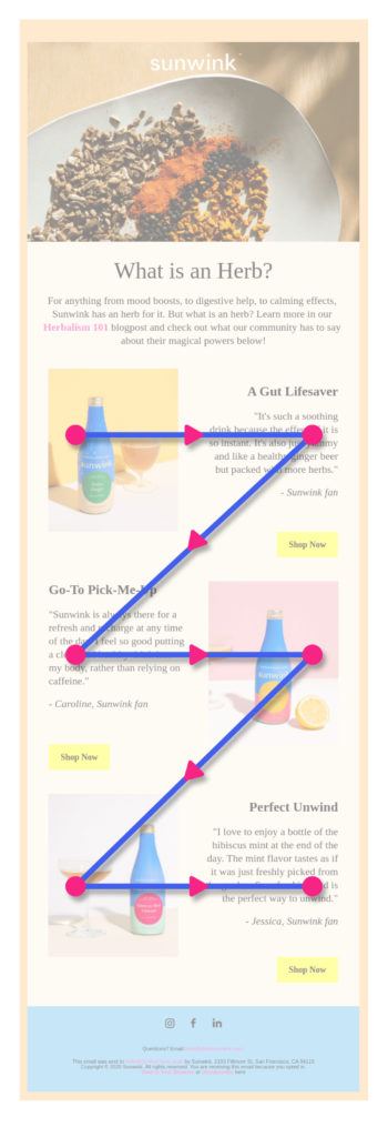
1 – Z-Pattern
The Z-Pattern traces the path of your eyes when reading, which is left to right, top to bottom.
People will read the first line across, then down and to the left, and back across the right again. When reading in this pattern, it forms a Z-shape.
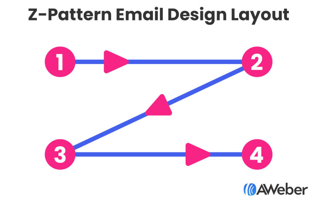
This email design layout is best used when you have a lot of information. This structure will help your subscriber consume all the information in an easy and logical way.
You will often see this type of email follow a pattern where you start with headline and text on the top left with an image to the right, then the lower left corner will have another image, across from that will be text. This works because:
- Readers’ eyes are naturally drawn to images. So by having the images diagonal from each other, you’re helping your subscribers follow an easy to read path.
- It creates a cleaner layout by not having all your text on one side of the email.
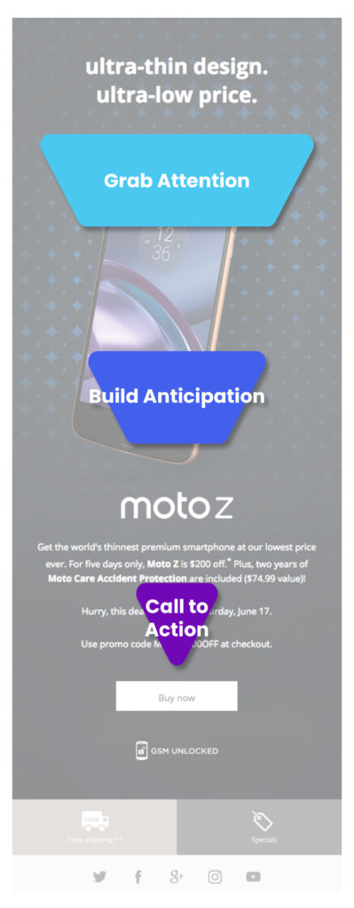
2 – Inverted Pyramid
The inverted pyramid is a format used for news stories, but it also works well for emails. It is structured to grab attention and focus on the most important parts of your message. It’s good for when you have one thing to tell your readers, and a specific call to action you want them to take.
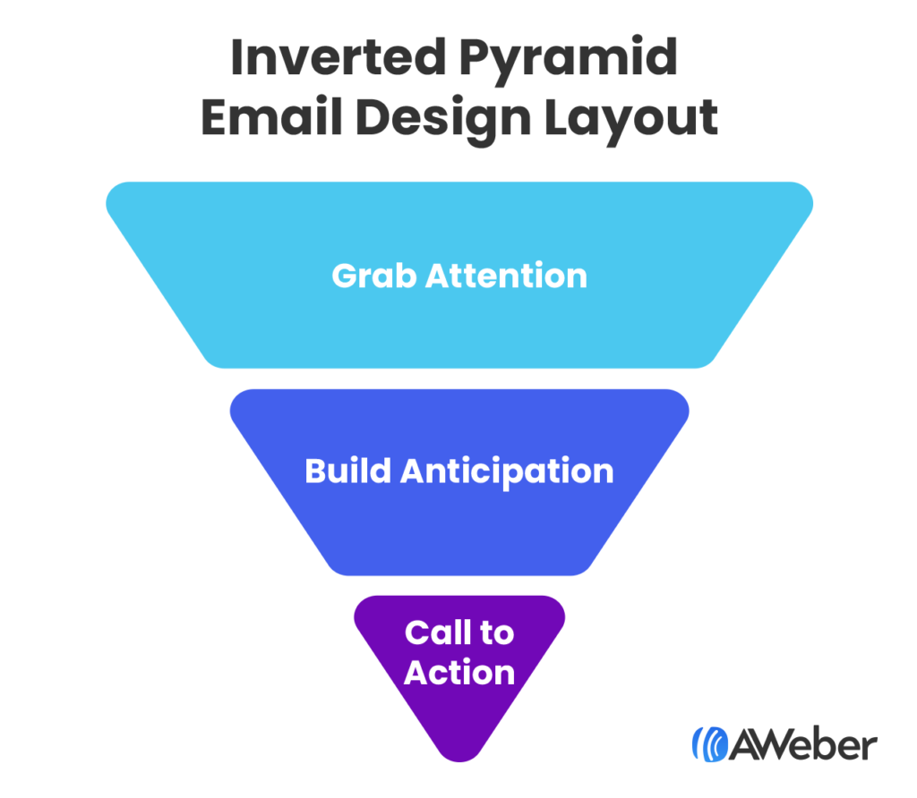
This layout can be used for driving subscribers to your website to read an article, to get sign ups for an event, or to purchase a single product or service.
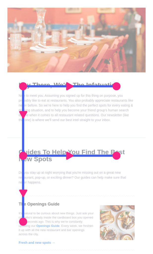
3 – F-Pattern
The F-Pattern was first identified by the Nielson Norman Group after studying how people’s eyes read a website.
Similar to the Z-Pattern, a reader would consume content left to right, then back to the left. But instead of reading across the second line, they would read less. And so on.
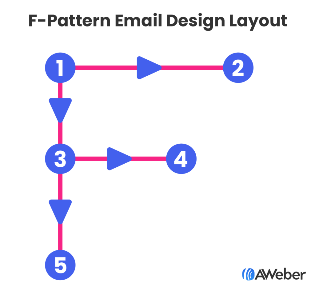
How does this information impact your email design?
First, you should put your most important, attention-grabbing information at the top of your email. Then assume your subscriber is going to skim the rest of your email. So use less text further down as you create your email. And balance your email with images to the right.
This email design layout is best used if you have a lot of information you want to communicate. In this case you should structure your email with the most important information at the top, then use bullets and shorter content further down the email, and close with a call to action.
Email design elements
Great content is an essential part of a successful email, and the design is part of that content.
1 – Choose the right colors
Select colors that reflect your logo and/or brand… but be sure that there’s enough contrast and clarity for your message to display clearly for easy reading.
Text that doesn’t have enough contrast against its background is hard to read.
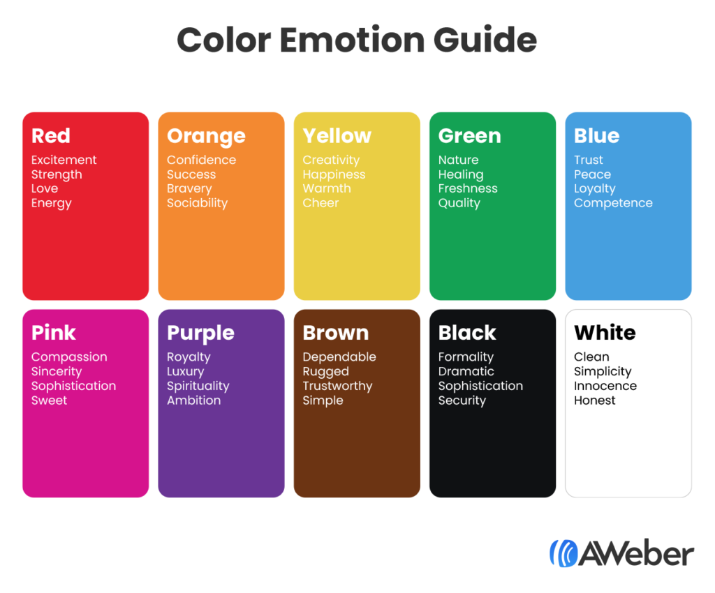
You can also use some of the color psychology we discussed above to select complementary colors. Check out this chart about the emotional impacts of different colors.
Free color palette tools like Coolors will help you create a professional-grade palette in minutes, so your emails will be more aligned with your brand.
2 – Leave some breathing room
Densely packed emails may be hard to read – especially on mobile devices, where 49.7 percent of all opens occur.
This is because most people scan emails, rather than reading them word by word. Having some white space between elements makes an email look easier to scan. It basically just makes the email look less visually overwhelming.
Leaving extra white space has an additional benefit: it challenges you to keep your message brief and to only include the relevant details.
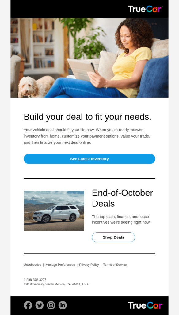
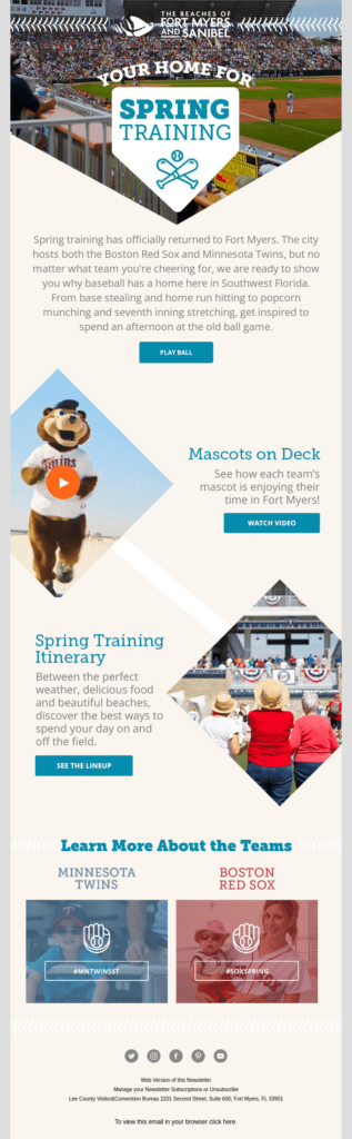
Here’s a great example from TrueCar.
3 – Use text as a design element
Formatting your emails for scanners also helps. The most common formatting elements are subheads, short paragraphs, bullet points, and bolded phrases. Using visual cues like these will make the most important points of your email easy to find.
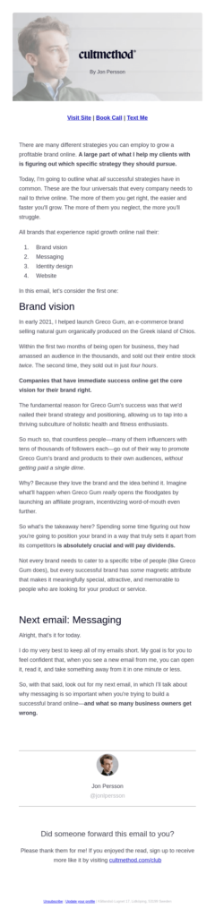
Look at this example from Jon Persson of CultMethod, he bolds important elements within the body of his email, he also breaks up the copy by using bullets and perfectly placed headlines. Plus each paragraph is short and easy to read.
4 – Balance text with images
Break up chunks of text with visual images. Readers prefer short blurbs of information, which can be easily achieved by including images and lines when necessary.
Images help tell the story of what you want to communicate to your subscribers, but don’t overdo it. Follow the 60/40 rule which states images should take up no more than 40% of your email.
5 – Plan for missing images
Nearly all email programs give subscribers the option to hide images. Some even disable images automatically, forcing the user to click a link or press a button to “turn on” images.
For example, here is how an email with a large hero image appears in Outlook:
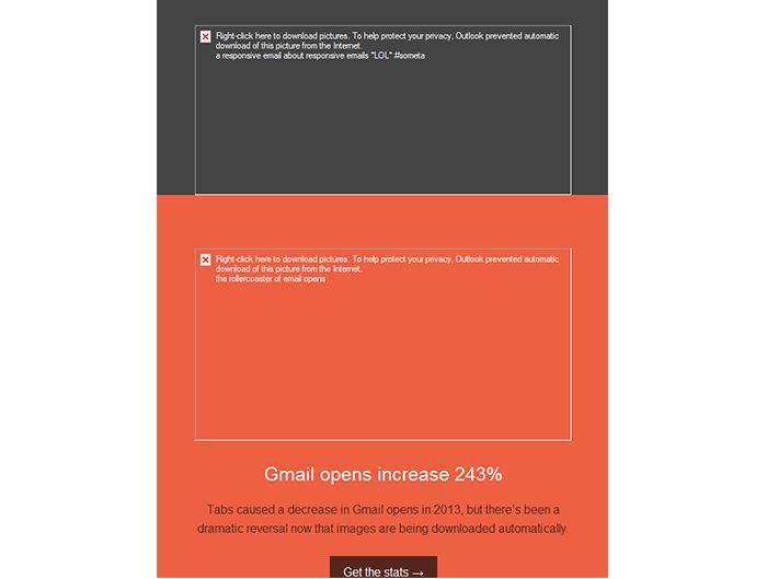
Since image blocking happens in many popular email programs, you should make sure your email is still readable—and your call-to-action is still clickable—when images are turned off.
Rather than using image-based buttons that will hide your CTA when images are turned off, try using a “bulletproof” button instead. This technique combines a background color with a regular text link, providing the illusion of a button that can be seen when images are on or off.
Most email marketing services (including AWeber) allow you to easily create bulletproof buttons within the email layout.
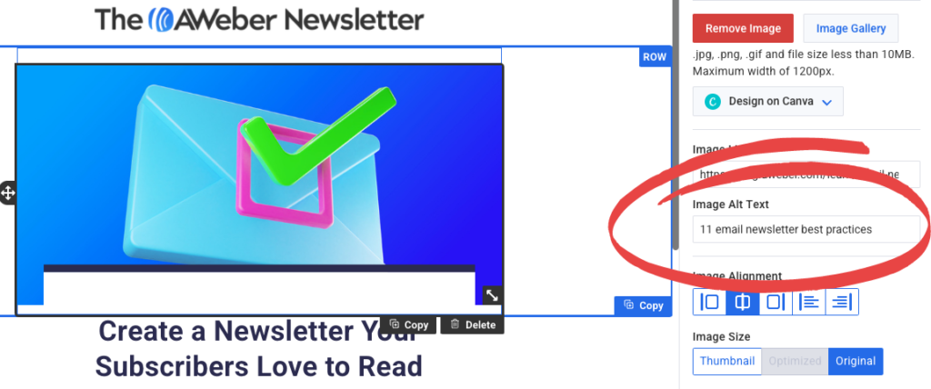
If the images you’re using are an important part of your emails, make sure you add the image alt text. This is text that describes what the image is about. If you’ve ever laid out webpages or worked with WordPress, you may have added alt text to images before. This is the same thing – just for email.
With image alt texts added, if your subscriber blocks images, they will still be able to read what you wanted to show them.
Email design tools for beautiful emails
You don’t need to start from scratch to create beautiful emails. Here are three email design tools that make getting started super easy.
1 – Canva
Canva is a widely-used free graphic design tool that allows you to create and edit any kind of image. AWeber has a fully integrated Canva drag-and-drop button, where you can create your images in Canva and drag them directly into your AWeber email.
2 – Email templates
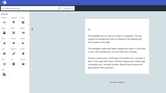
Sometimes simply getting started is the hardest part of sending an email. This is where an email template can come in handy. When you find the right template, most of the work is done for you. Just customize it to fit your brand by adding your logo and updating the colors, then you’re ready to go.
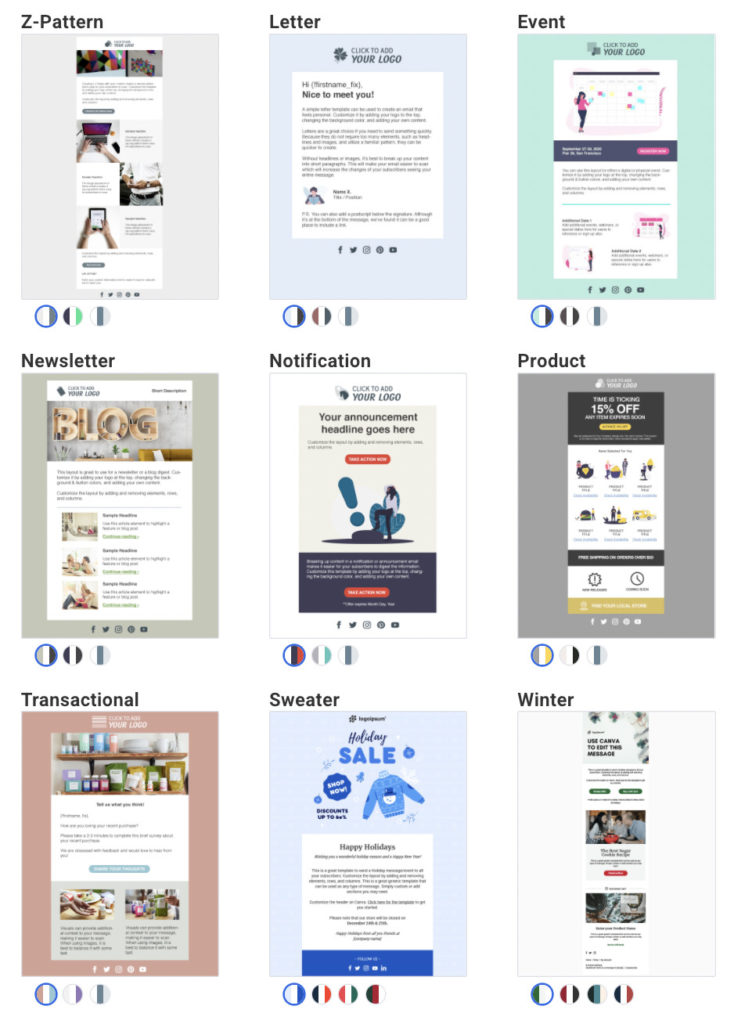
AWeber now has over 600 email marketing and newsletter templates ready for you to customize for your messages. These can save you hours of time every week and let you skip all the work of designing your own emails.
Here are just a few of the templates available. Each template also has at least three color palettes to choose from.
3 – Try an email builder
Online tools like Stripo, BeeFree, and Dyspatch also have templates and drag and drop email editors. They are similar to what you’ll find in your email marketing provider’s account, but some email designers prefer these tools.
You can design an email in any of these tools and then import it into AWeber, or copy the code from the email builder and paste that into AWeber. There are instructions for how to do that with Stripo here.
Start using these email design best practices
If you’re not a pro designer, the task of designing an email may seem a bit intimidating. But if you follow these email design tips or use a pre-made email template provided by your email marketing platform, sending beautiful emails can be easy.
Of course, if you want a custom-designed email or newsletter, we can help with that, too. AWeber offers custom email template and landing page designs. Full custom designs are $229, or a modification of an existing template is $29. Click here to learn more about our custom design services.